
Every symbol on your dashboard is trying to tell you something — but not all of them make it obvious.
You know the routine. You start the car, a light pops up, and suddenly you’re staring at some tiny yellow picture trying to decide whether it means “keep driving” or “this is about to get expensive.”
Katie Allanson gets those questions a lot.
Allanson is a human factors expert at Ford Motor Company. She also chairs the Vehicle Controls and Displays Committee at the SAE (Society of Automotive Engineers) and the International Standards Organization.
Friends will send her pictures of their dashboards asking whether they should be worried.
One symbol comes up again and again.
“The one that stands out the most for me is tire pressure monitor,” Allanson says. “And that’s the one that says maybe your tire is low or there’s a fault in the sensor.”
Once you know what you’re looking at, the icon starts to make more sense. But the shape is only one part of the message.
The color matters, too
Before a driver even figures out what a symbol represents, its color can provide an important clue.
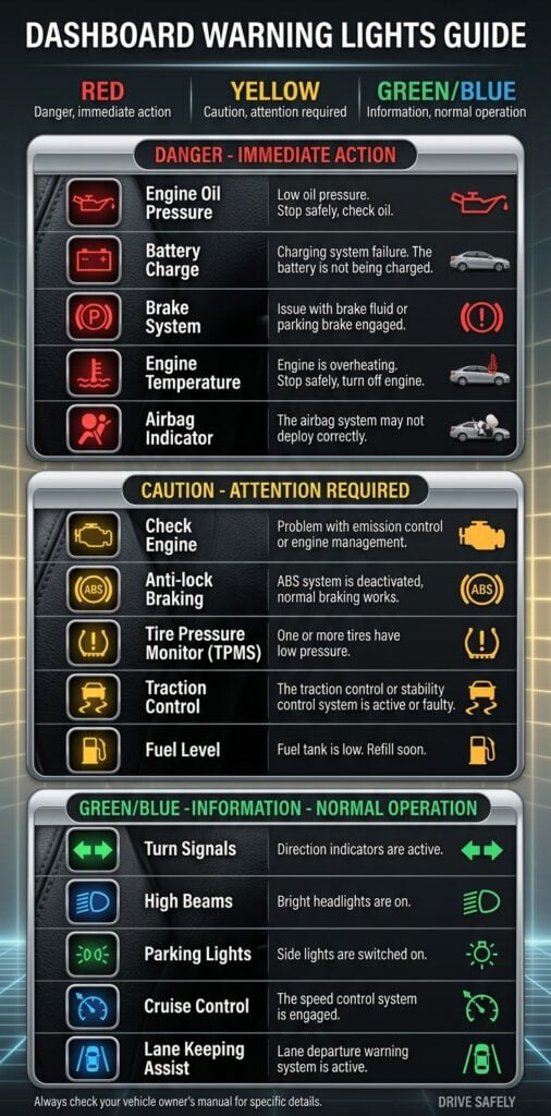
“So the color coding has some legal meaning, but it’s mostly for visibility and for urgency,” Allanson explains. “So the red means that there’s an immediate safety or danger alert.”
A brake malfunction or seat belt reminder are among the examples she gives.
Amber or yellow is generally used for a malfunction or advisory, while green typically signals that a feature is operating normally.
Blue has a more specific use drivers may already recognize.
“So if your high beams are on, that will always be blue,” Allanson says.
Some newer vehicles also use gray to show that a feature is in standby.
It all helps reduce the amount of information a driver has to process while moving down the road.
Why use symbols when cars have screens?
Today’s vehicles can put full sentences, graphics and detailed alerts right in front of the driver.
But there are plenty of moments when reading more information isn’t necessarily better.
“We need little symbols for the quick glance-able information that we need,” Allanson says.
That can be enough for something straightforward: a warning light, tire-pressure alert or confirmation that the headlights are on.
More complicated driving systems can require more.
Allanson points to driver-assistance features that may need to show where the vehicle is in a lane, what’s happening around it or whether the driver needs to retake control.
In those cases, symbols can work alongside words and other graphics.
The balance is giving drivers what they need at that moment without piling on so much information that it becomes harder to process.
Why some symbols look so old
Not every dashboard icon has kept up with the object it represents.
Take the little telephone handset still found on many steering wheels.
For younger drivers, that curved receiver may have little connection to what a phone actually looks like today.
Yet changing it could create an entirely new problem.
“We just don’t change them because so many people in the market are familiar with it already,” Allanson explains. “So we’re just not going to change that handset to like a smartphone design because it’s already understood, it’s recognized, even though that metaphor isn’t quite accurate anymore.”
That tension — between modernizing an icon and preserving something people already recognize — is one of the challenges behind dashboard design.
And some of those symbols aren’t simply up to an individual automaker.
Allanson says certain vehicle symbols are regulated across markets, which can make even seemingly small changes complicated.
A new symbol can take years
When new vehicle technology does call for a new icon, designers don’t simply draw one and put it into a car.
First comes the question of whether a symbol is needed at all.
Then engineers and designers determine what it needs to communicate and where it will appear. Proposed designs are collected and narrowed down.
After that comes one of the more interesting parts: finding out whether actual people understand them.
Allanson says proposed symbols can undergo comprehension testing in different countries.
That can expose differences that have little to do with the quality of the design itself.
She points to testing for a sway-bar disconnect symbol. The feature is familiar to drivers of vehicles used for off-roading, which helped the symbol perform better in North America than it did in Europe.
Those kinds of results matter because a symbol that seems obvious in one place may not carry the same meaning somewhere else.
Eventually, committees vote on a design and, if approved, it can be published as part of an SAE or international standard.
“Sometimes it takes us a couple of years to get through and sometimes it’s quick and maybe a year,” Allanson says. “And then once we’re done with all of that, you might see it in your vehicle.”
That’s a lot of work for something a driver may look at for less than a second.
A language designed to travel
The payoff to all that standardization becomes clearer when you get behind the wheel of an unfamiliar car.
Some regulated symbols are designed to stay recognizable across vehicle brands and international borders.
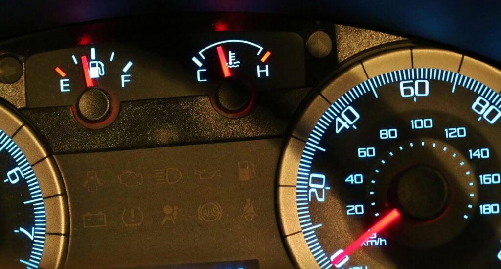
“And symbols give us an opportunity to speak a common language amongst all these different drivers and different OEMs in different countries,” Allanson says.
That also means keeping written language to a minimum.
“Just things like off and on and auto and start, stop, echo. Those are normal words we’ve allowed into the database, but we avoid English words so that we can speak the language of symbols,”Allanson explains.
So a driver doesn’t necessarily need to speak the local language to recognize an important warning in a rental car halfway around the world.
More technology means more to explain
The challenge is only growing.
Allanson began her career in 2002. Since then, vehicle displays and driver-assistance technologies have changed dramatically.
“I see the future being a little bit more of a modernization to meet the function of the vehicles today,” Allanson says.
That could mean updating older symbols, but it also means making better use of the screens already inside modern vehicles.
The goal, she says, is to provide enough detail when it’s needed without overwhelming the person behind the wheel.
One tiny arrow worth knowing
Not everything on the dashboard is warning you about a problem.
One of Allanson’s favorite examples is sitting beside the fuel gauge.
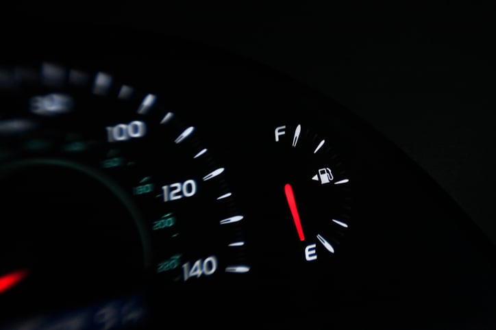
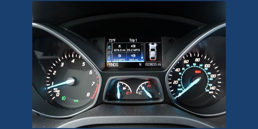
Look closely at the little gas-pump symbol in many vehicles and you’ll see an arrow.
“It’s got this little arrow that tells you, it indicates what side your gas tank is on,” Allanson says. “So I wish people understood that.”
If the arrow points left, the fuel door is on the left side of the vehicle. If it points right, it’s on the right.
It’s a small detail.
But the next time you pull into a gas station in an unfamiliar car, it might be the most useful symbol on the entire dashboard.
Your dashboard may only get a second of your attention — which is exactly why every symbol has to count. And once you know how to read them, your dashboard starts looking a lot less mysterious.